
Art Spark Dance embodies the ethos of community dance. They aim to make a positive contribution to wider social change by bringing their artistic work into public spaces, sharing their expertise of community and inclusive dance with future dance artists and educators.. This project is intended to improve the user experience of their website. We have emphasized upon usability research and testing to identify opportunities in the existing user experience and recommend improvements
Role
End to end UX design
Heuristic Evaluation
Competitive Analysis
User Research
Usability Testing
Team
Ananya
Anita
Sushant
Varsha
Vj
Type & Timeline
Usability research and testing
4 months
Tools
Figma
Figjam
Problem Overview
The current website for Art Spark Dance serves as a source of information about the organization's initiatives and events for all visitors. However, visitors and stakeholders face issues in finding relevant information and in other user tasks such as making a donation.
Design Challenge
Improve the existing website of Art Spark Dance so that the users can easily understand, explore and participate in their initiatives.
Solution
Our team came up with recommendations and improved design for user flows which will help website visitors to achieve their intended objectives easily.

Understanding the Task
Our first step was to understand and identify our design scope. What are the major challenges that users face in current website?
Objective
-
Clear information and visual hierarchy
-
Improved donation user flow
-
Well communicated organization identity.
Stakeholder Inputs
-
The website is their primary mode of engaging patrons.
-
Unhappy with the current donation flow. Need a way for users to select initiative for which they wish to donate.
-
Currently, their biggest challenge is availability of accessible dance spaces.
Personas
-
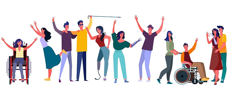
People with disability interested in participating in the dance initiatives.
-
Individuals willing to contribute to their cause
-
People who want more information about the organization
Possible UIUX
-
Better labelling and information organization
-
Improve site navigation
-
Aesthetic and minimalist design
Heuristic Evaluation
As a first step of research, Heuristic evaluation was useful in understanding currently usability issues and identifying the scope of improvement.
Consistency & Standards
Users should not have to wonder whether different words, situations, or actions mean the same thing.
There is inconsistency in the visual properties of elements such as buttons and links. They have different fonts, sizes, types and backgrounds colors.
The “Contact Us” button on the menu and footer lead to different pages with dissimilar content. Having multiple contact us pages often confused the user while reaching out to the team.
Visibility of System Status
Always keep users informed about what is going on, through appropriate feedback within reasonable time.
Carousel on the home page has no indicators about the number of frames and the wait time before switching to the next frame.
If a card is declined while making a donation, the error message is represented as plain text which is difficult to identify.
Competitive Analysis
This helped us understand how other NGOs are currently presenting their initiatives and also identify opportunities of improvement for ASD


Usability Testing
-
We conducted eight moderated in-person usability tests with one moderator and one notetaker.
-
There were six task scenarios to test whether users can:
-
Register for a workshop
-
Message Art Spark Dance
-
Signup for a newsletter
-
Make a donation
-
Follow ASD on their social media pages
-
Browse through the podcast list
-
-
We applied a think-aloud protocol to identify user’s thought process and gather their feelings toward the website.
Data Collection
-
Audio and video recording of participant.
-
Screen recording of the actions being performed by the participants on the website
-
Moderator and notetaker notes.
-
Likert and SUS scores filled by the participants after each task (likert scale) and the end of the test (SUS).
Data Analysis
-
We first compiled our moderator and notetaker notes into an excel sheet for each of the tests we did.
-
Compiled and analyzed the Likert and SUS scores to gather quantitative insights.
-
Created affinity maps based on the notes we took to visualize trends.


Participant Recruitment Criteria
-
Qualification criteria for the test:
-
Age between 18 to 65
-
Have experience assisting people with disabilities
-
Living in Austin, TX
-
Have undertaken training in any type of performing arts
-
Interested in joining a dance class
-
Have experience contributing or donating to any NGO
-
Are comfortable browsing websites on a computer or tablet
-
Have provided digital for a person with disabilities

Task Analysis
Success rate (% of participants who could successfully complete the task) and categorization of tasks into Completed With Ease, Completed With Difficulty, Could not Complete. We can see that the success rate is high for most of the tasks, a large number of participants faced difficulty in completing them.


We then plotted Time On Task and Task Completion Scale to quantify where participants faced most difficulties. These two metrics can be good comparison standards for checking future site usability after the improvements are done.


The following graph captures the responses of standard SUS questionnaire. It helps in measuring the perceived ease of use for the website. The industry standard for minimum SUS score is 68, however, it was 35 for this website. It signifies very poor ease of use.


Observations
-
Navigation issues with irregular placements, unclear label terms and take users to Art Spark Texas without notice.
-
Design elements are not regulated and poor color contrast makes it inaccessible.
-
Unfunctional links like social media and videos with crashed pages caused users’ mistrust.
Recommendations
-
Use standard design and general consistent language throughout the website.
-
Keep users in Art Spark Dance and don’t direct them to other pages without notifying.
-
Follow accessible design guidelines for the entire web.
-
Ensure the website has good error handling and proper responses to actions.
Future Scope
-
Testing can be done with actual participants after getting the test plan approved from IRB. This would be helpful to understand their pain points.
-
Accessibility features can be incorporated to assist people with disabilities access information about Art Spark Dance.
-
KPIs calculated can be used to compare the results obtained from further usability testing.
Key Takeaways
-
Communication with actual stakeholders was crucial to understand context and operation details for Art Spark Dance.
-
Conducting a pilot test helped us better prepare for the actual usability tests by making necessary improvements in the moderator script.
-
Parallel design collaboration as a team to bring out the best of individual ideas and collate them to make design decisions.