UTFoodPal is a mobile app for UT Austin students which will help them access information about food resources in and around campus.
My Role
Research: Secondary Research, Interviews, Card Sorting, Affinity Map
Design: User flows, sketches, lo-fi and hi-fi wireframing, prototyping
Team
Team of 4 - All UX Designers - VJ, Jenny John, Riya Sinha, Sahari Kumar
Tools
Figma, Miro
Context
This is an academic case study as part of Information Architecture course during Fall 2022.
Food insecurity is a common issue faced by students on UT Austin campus. And there are several factors like money, time, lack of transportation, etc. which prevent students from having access to food resources. UT Austin and its associated organization do have initiatives that try to address this concern. But the problem is - Students do not know about these initiatives.
Hence, we decided to explore solutions for connecting students with appropriate food resources.
Understanding Food Insecurity
Our Process
Research Phase 1
Secondary Research
Stakeholder Interview
Initially, we conducted exploratory research to dive deeper into our problem space. This phase consisted of literature review and exploration of standard definitions of Food Insecurity.
1
In 2021, a survey conducted by the UT Food Insecurity Action Team (FIAT) found that, one out of three UT Austin students is food insecure.
2
From our personal student experience we know that information about food resources and food distribution drives is scattered. Though various department do sometimes include these resources in their monthly newsletters, there is no centralized platform for UT Austin community to access this information.
3
Right now, the digital presence of UT Austin food pantry is pretty minimal, limited to a single web page on Student Emergency Services website. We initially thought to improve this website so that students have better idea of their ways of operation and stock inventory, which currently the site does not support.
4
Researching more into the problem we realized the the list of food resources on campus is not limited to food pantry, there are a lot of recurring initiatives as well as one time distribution drives that students can't access because of lack of information.
UT Outpost was UT Austin's primary initiative to address the problem of food insecurity. To understand their ways of operation and the challenges they face, we conducted an interview with the program coordinator at UT Outpost, along with members of the UT Communications team
Key Observations From Stakeholder Interviews
-
It is part of Student Emergency Services and managed by its staff and student volunteers.
-
Primary source of funding is University grants, donations and collaborations with supermarkets
-
It does not have separate website nor the resources to build and maintain one.
-
Some of the operational challenges are - Inconsistent donations, stigma, limited space.
This made us look in three possible directions:
1.
How do we improve awareness and promote UT Outpost?
2.
How do we improve the user experience of UT Outpost as a service?
3.
How do we promote awareness about all food resources provided by UT in addition to UT Outpost?
Next, we conducted Survey and Interviews to get an insight if at our fellow students do face issues while accessing information about food resources in an around campus. And if they do, what were the issues.
Research Phase 2
Survey
User Interviews
Competitive Analysis
We created a survey to learn about food resources related awareness and behaviours. We received 36 survey responses from students all across UT.
50%
Of the surveyed students answered that they never used food resources provided by UT.
Social Media & Word of Mouth
Were the primary sources of information as well as updates about food resources and events.
57%
Rated the access to healthy food in and around the UT campus as "Poor".
Insights from user interviews
We conducted structured interviews with 7 participants in total, out of which 3 had never been to UT outpost. The rest 4 had different frequencies of visiting UT outpost and mixed experiences of availing other food resources.
1. What are the challenges that UT students face in accessing timely, nutritious and healthy meals?

2. What are the barriers faced by UT Students in accessing available food resources?

The following interview intercepts were captured from UT Food Insecurity Action Team’s 2021 Report:
“I think more awareness needs to be made about those services and also just that there are so many people that are food insecure on campus. As a student that hasn’t dealt with food insecurity, it’s easy to forget that there are others struggling.”
“There needs to be more information widely circulated about resources for students. I think a lot of students do not realize that many of their peers are hungry/do not have money for healthy food/etc. I know nothing about UT Outpost except that it exists and that students can only get food once a month. This does not seem like enough, but I do not know the amount of food or type of food that comes in this package.”
We then conducted Competitive Analysis to understand other initiatives and organizations working to address this problem. The Competitive Analysis Report can be accessed here.
This analysis helped us understand 2 things:
-
What type of resources can students be made aware of.
-
Different ways in which university pantries can operate to ensure maximum
students can avail their benefits.

Ideation & Design
How might we
Personas
Affinity Maps
Card Sorting
Sketches
Content Inventory
In order to effectively guide our ideation phase, it was necessary to distill our insights into concrete actionable questions. The following How Might We statements are a result of our synthesis:

Personas
With the research insights gathered, we created two personas as shown below:
1. Michael is only interested in free food resources if he can get healthy food options conveniently.
2. Sara is dependent on free food resources in order to manage her monthly expenses.


Personas helped us get a clear understanding of our users' needs, behaviors, experiences and goals.
To decide which platform should we choose to present this information, we evaluated pros for each
Web
Mobile

We decided to go with mobile because we wanted to prioritize our users' ease of use over everything else
Affinity Diagram
After deciding to go with mobile, we began by listing out the features each one of us imagined being present in the platform that we designed. We broadly grouped them using affinity diagrams as shown below. It helped us identify and put together closely related pieces of information.

With all of the features in mind, we proceeded to make a Content Inventory of our proposed platform. Content Inventory can be accessed here.

Next, in order to visualize and share our ideas, we created a set of sketches as shown below.
It was good time to decide what type of device we want to host our platform on.
-
Most of the UT resources are Web based and it makes it intuitive for a new student to access a UT website for information like this.
-
However, for someone who is familiar with the platform and wants to use it in between classes or when they have spare time during the day, which is most likely the case, it makes more sense for this information to be delivered through a mobile App.
-
An app would also make it easier to have functionalities like login, which would be useful when the user want to save or register for an event.

-
After running these design through 3 participant we realized that the terminologies that we have used as throughout the app, including in filters, do not match the understanding of our users. For e.g. our participant could not make out the difference between events and initiatives.
-
This was an important hurdle since our organization was based on these labelling.
-
In order to understand how our users differentiated between different events, we performed card sorting with 16 participants.
-
These categories that came out of card sorting formed the basis of our iterated designs.

Possible filters for the the list of events
Card sorting helped us revise our sitemap.

Rationale for IA decisions
As the main purpose of the application is to present information to users in a seamless way, majority of our information architecture decisions were focused around organization and search categories of the system.
App Hierarchy
Our application has categorized different features based on the 4 main sections.
-
Home
-
Resources
-
Community
-
Profile
This decision was made to maintain clarity in the different offerings of the app. This also formed the global navigation system of our application.
Search and Filtering
Categorization of food resources formed the basis of our search and filtering system.
Three ways of categorization took place -
-
Type of resources distributed/given
-
Affiliations of these resources
-
The way these resources are being accessed by students


Displaying resources
Resources are listed in 3 ways on the homepage
-
List view
-
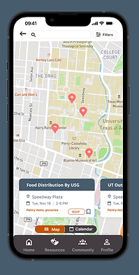
Map view
-
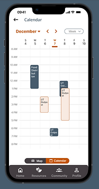
Calendar view
These different views have been integrated to allow users to see all resources in a go, view resources on maps to get a sense of their location, and add upcoming events to their calendars.
List View
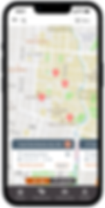
Map View
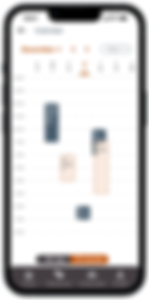
Calendar View
High Fidelity Prototypes
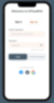
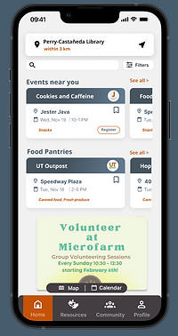
Log In: Allows user profiles and saving user preferences. For better flexibility users have option to continue as guest.

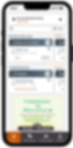
Home: Lists out categorized resources, has primary navigation bar, option to View as Map/Calendar, search, set location and filter.
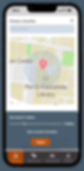
Set Location: Get curated list based on your location
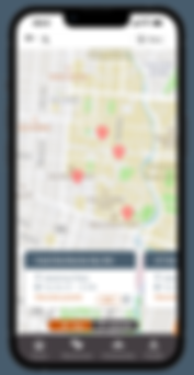
Map View: Helps students access resources which are nearest to them
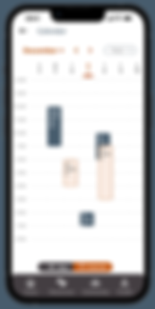
Calendar View: Helps students plan their schedule ahead of time. Gives option to customize the calendar view
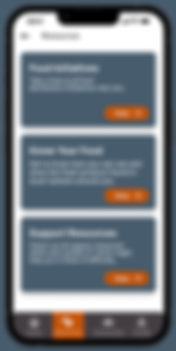
Resources: Lists 3 categories from where students can avail food resources
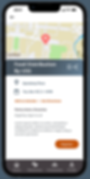
Resource Details: shows location, time, eligibility, and distribution type. Gives users option to register, save, and share.
Initiatives: They are recurring and more structured compared to events.
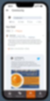
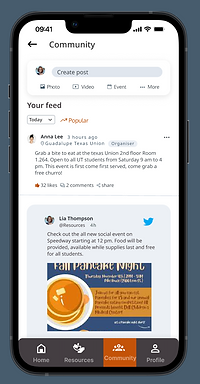
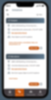
Community: A platform for students to share and discuss food distribution related information.
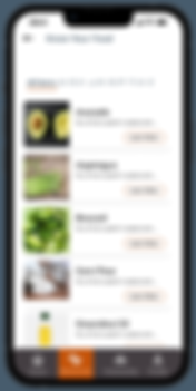
Know Your Food: Gives a list of grocery items found in local Austin supermarkets. Helps students, especially international students, know about local produce and how to use it.
Challenges
-
This is a complex problem space. Food security means different things to different students and its very subjective how students perceive the need to avail free food resources. Moreover, resources come in all shape and sizes, with their own ways of operation. This presented a challenge in coming up with categories for them.
-
Changes need to be more systemic - lot of surveyed students mentioned subsidization of University Housing and Dining meals, reusing meal plans, etc. These steps can only be executed at administrative level.
-
Restrictions identified through insights gained from the stakeholder interview played a major role in changing the course of the project. It made us look beyond UT Outpost. This helped broaden the scope of our project.
Future Scope:
-
We would like to reach out to more students who are at a higher risk of food insecurity to capture their experiences with the food distributions in and around campus.
-
In depth usability testing could be done to further improve the design of our applications high fidelity screens.